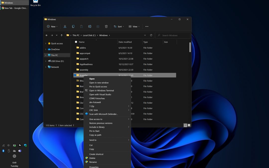
I recently installed Windows 11 at home. Welcome to the colorful MAC world – at least that’s what it looks like.
Microsoft has done a lot for the optics, e.g. removed all basic functionality. The constant trend towards more and more immersion, which found its way into previous Windows versions, did not stop at Windows 11 either. As an “old hand” in the Windows world, I’ve always liked it when things were clearly named and easily accessible – in the taskbar, for example. Small buttons – to make the best possible use of the space. No grouping – saves a click or a mouse movement. Show text – to move efficiently through programs.
In previous versions, these features were removed and other standard settings were set for the user. In Windows 11, however, Microsoft took it to the extreme. The user is no longer even able to choose how and where he wants the taskbar to be displayed. At the to or at the bottom, of course. Left or right, no. Ungroup, no. Show text, pfff.
If you want to give Windows 11 a chance and still don’t want to do without efficient work with a neat taskbar, you can download and install the Windows 11 Explorer Patcher at https://github.com/valinet/ExplorerPatcher. This patches the Explorer process and “installs” the Windows 10 taskbar. The website describes what needs to be done for the installation and how settings can be configured afterwards.
Btw. The new, immersive context menu for files and folders in Explorer can also be turned off with this patch.
So if you want to display text on your taskbar icons, or if you want to ungroup or disable grouping on the Windows 11 taskbar, or if you want your taskbar on the left or on the right hand side of the screen again, or if you want to disable the new Explorer context menu try the patch. It is not affiliated to me. I tried it – and for me – it works.


Recent Comments